Personal product project · Active development

Case study · Flagship web app

Noted

A calm, local-first notebook designed around the real rhythm of conventions and assemblies: listen, capture what matters, and return to the exact context without rebuilding it.

Project snapshot

AudienceJehovah’s WitnessesPersonal convention and assembly notes
My roleProduct + interface directionWorkflows, structure, visual system, iteration
StatusLive betaStill evolving through real use

The starting point

The program is already organized. The notebook should understand that.

Generic note apps are flexible, but that flexibility creates work during an event. A user may need to create folders, name pages, copy talk titles, and remember where a note belongs while also trying to listen.

Noted began from a more specific question: what would note-taking feel like if the app already understood the program, the day, the session, and the user’s next likely action?

Project evolution

From a notebook idea to an active product system.

The most useful progress came from repeatedly reducing setup, preserving context, and making the next action easier to see.

These are product phases rather than exact release dates. The screenshots show the current product; earlier stages are described from the decisions that led to it, not presented as archived interfaces.

01

Notebook first

Start with the listening routine, not a generic editor.

The initial direction centered on one personal notebook for conventions and assemblies. Defining the routine first kept the product focused on listening, capturing, and returning rather than becoming an all-purpose notes app.

02

Structure arrives

Let the program organize the notebook.

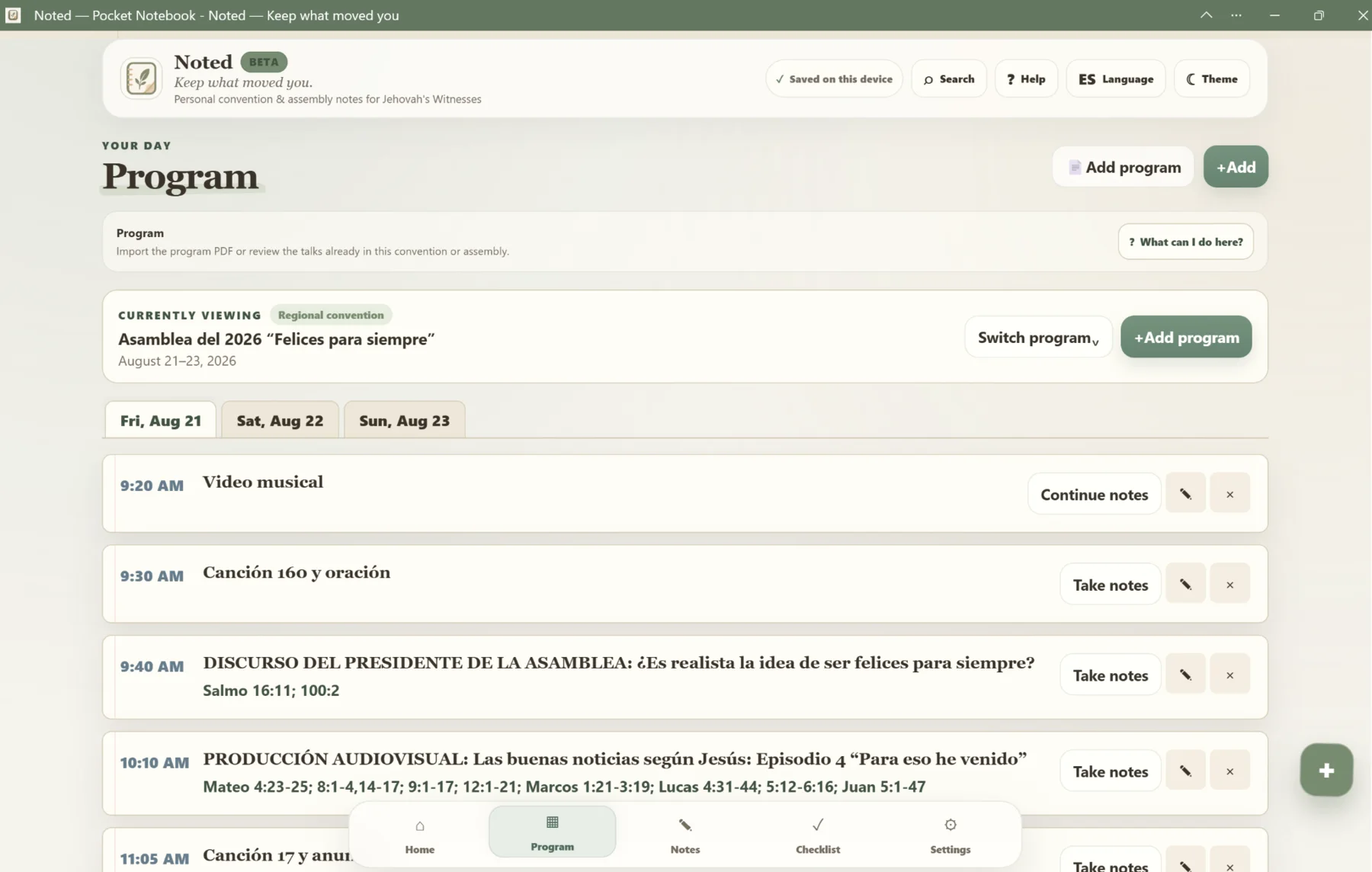
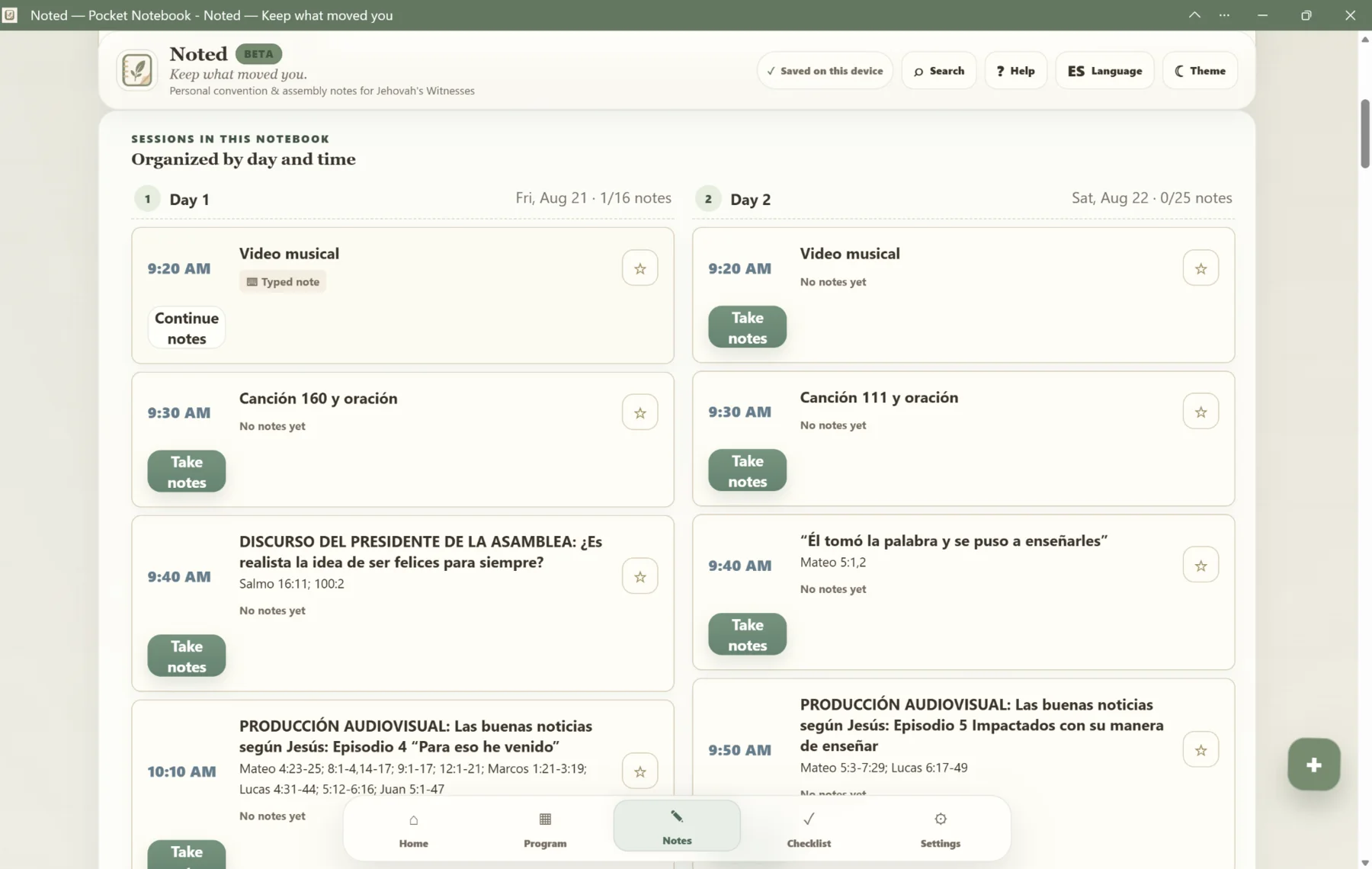
Instead of requiring users to create folders and copy talk titles, the schedule became the information architecture. That connected each note to its day, time, and session before writing began.

03

Context continuity

Make leaving and returning feel safe.

Scripture lookup, interruptions, and switching sections should not make the user rebuild their place. The product direction shifted toward preserving the exact notebook and session context across navigation.

04

Responsive + bilingual

Treat phone use and Spanish as complete experiences.

Mobile navigation, touch targets, compact layouts, English, and Spanish were refined as product behavior—not added as decorative adaptations after the desktop interface was finished.

05

Next-action clarity

Move the current event and useful continuation point forward.

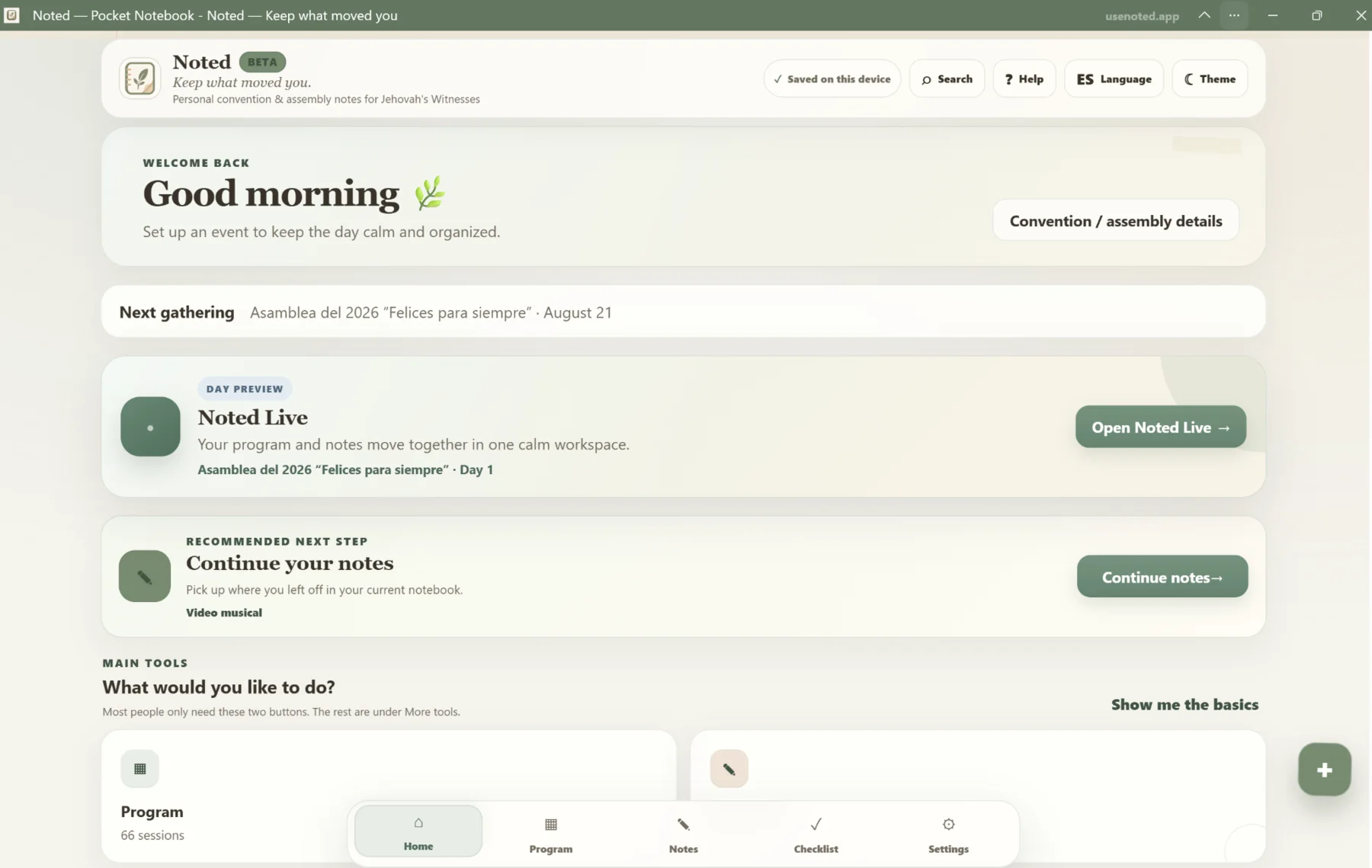
The dashboard evolved from a collection of tools into a calmer decision surface. Noted Live, the next gathering, and “continue your notes” reduce the number of choices a user must make before returning to the work.

06

Current beta

Harden the experience instead of endlessly adding features.

The current phase emphasizes accessibility, bilingual consistency, import reliability, offline behavior, backups, and respectful companion workflows. The goal is a dependable personal tool, not the largest possible feature list.

The problem

Reduce organizational work while the program is moving.

Setup steals attention

Creating files, copying titles, and deciding where information belongs can interrupt listening before the note is even written.

Context is easy to lose

A user may leave briefly to look up a scripture or reference. Returning should not mean hunting through a generic document.

Large interfaces become noisy

A note app can have many useful tools while still making the two or three most common actions difficult to find.

Personal study data needs restraint

The product should not require unnecessary accounts or pretend to offer official integration with another app when that support does not exist.

How the product evolved

Built through repeated simplification.

The work did not move in a straight line. Each pass focused on making the product easier to understand during real use.

01

Define the real routine

Mapped the event around programs, days, sessions, notes, and personal follow-up instead of starting from a generic document editor.

02

Connect the views

Made the program, notebook, and session list behave like parts of one experience rather than separate pages with duplicated setup.

03

Simplify the home screen

Moved the current event and recommended next action forward while placing less-common tools behind clearer secondary paths.

04

Keep testing the wording

Adjusted labels, hierarchy, English and Spanish content, and return paths so the interface explains itself with less instruction.

Product decisions

Choices tied to the real use case.

Each decision removes friction before, during, or after the event rather than adding a feature simply because it is possible.

01

Program-aware organization

Sessions receive their place before the user begins writing, so the event’s structure does the filing work.

02

Calm next actions

The dashboard prioritizes the current event, the next gathering, and the most useful continuation point.

03

Local-first data

Notes are saved on the device by default, supporting privacy and making the product usable without a required account.

04

Companion, not fake integration

The direction is to reduce friction around scripture lookup and returning to Noted without promising official JW Library synchronization.

05

Bilingual interface

English and Spanish are treated as complete interface experiences rather than decorative translation afterthoughts.

06

Progressive complexity

The basics remain prominent while importing, editing, settings, and other tools stay available without dominating the screen.

My contribution

What I personally directed and shaped.

This wording is intentionally specific: the case study focuses on the work I can confidently explain rather than overstating a formal engineering role.

Product definition

Identified the audience, the event routine, the primary user problems, and the product boundaries.

Information architecture

Organized programs, days, sessions, notes, checklists, and navigation into connected workflows.

Interface direction

Shaped hierarchy, visual tone, responsive layouts, labels, and the calm interaction model.

Iteration

Reviewed builds, identified friction, rewrote prompts and requirements, tested changes, and continued refining the product.

What I learned

Useful products often improve by removing decisions.

The strongest Noted changes were not the most technically dramatic. They were the changes that made the next action clearer, preserved context, and reduced the amount a user had to organize while listening.

What is still evolving

This is a live project, not a frozen showcase.

Current areas of attention include smoother context return, accessibility, bilingual consistency, import reliability, and a respectful companion workflow around scripture lookup.

Explore the current beta ↗

What this demonstrates

Product thinking around a specific human routine.

Noted demonstrates designing from a routine I personally understand, information architecture, responsive interface direction, iterative problem-solving, and the discipline to keep simplifying after a product becomes usable.

Project status

Active development.

The live version continues changing as I use it, test it, and simplify the workflow.

Open usenoted.app ↗

iquitby iquit studio