Where gardens grow and stories bloom.
A warm, decorative brand-first direction with soft shapes and broad messaging.
This is a reconstruction of the earlier direction—not an archived screenshot. It shows the qualities that were later reconsidered.
Case study · Live local-business website
A responsive website created to help Los Angeles homeowners understand the service, build trust quickly, and begin a useful conversation through phone, text, and yard photos.
Project snapshot
The business need
The business needed more than a decorative homepage. A homeowner should quickly understand what kind of work is offered, whether the service covers their area, and how to request an estimate without filling out a complicated form.
The website therefore had to feel professional and established while staying direct, approachable, bilingual, and appropriate for a small local operation.
Live interface
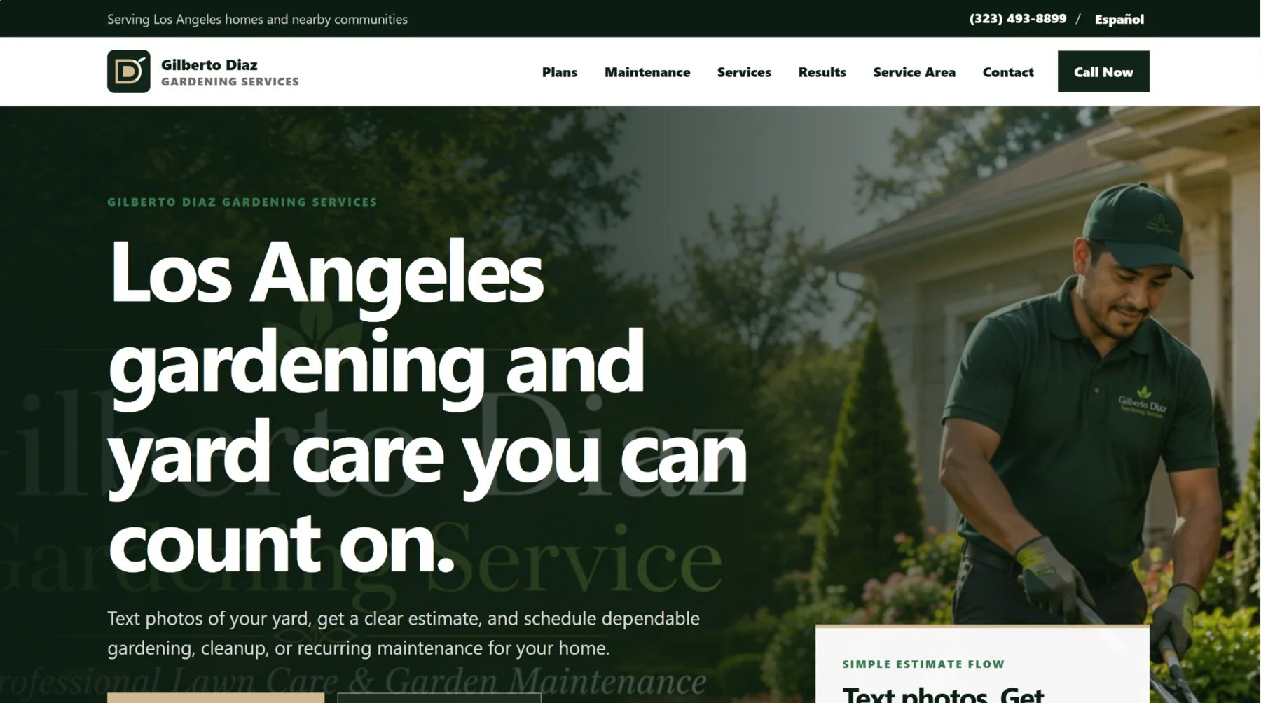
The current hero immediately identifies Los Angeles gardening and yard care, then explains the estimate path in everyday language.

Before and after
The improvement was not simply “more professional colors.” The hierarchy, message, actions, and mobile journey were reconsidered around what a homeowner needs to know.
A warm, decorative brand-first direction with soft shapes and broad messaging.
This is a reconstruction of the earlier direction—not an archived screenshot. It shows the qualities that were later reconsidered.

The live version leads with location, service, contact options, and a practical estimate path.
The problem
A homeowner may know the yard needs attention without knowing whether to ask for recurring maintenance, cleanup, trimming, planting, or another service.
Photos, the property location, the requested work, and timing make the first conversation more productive than a generic “contact us” message.
The first design direction felt too playful. The website needed stronger typography, clearer hierarchy, and a more professional tone without losing warmth.
Calling, texting, checking the service area, and sending photos must remain easy on a phone rather than functioning only on a large screen.

Project process
The biggest improvement came from treating critique as part of the design process instead of protecting the first version.
Organized maintenance, plans, services, results, service area, and contact information into a clearer customer path.
Moved away from an earlier kid-like appearance toward stronger typography, deep greens, cleaner spacing, and a more premium local-service identity.
Prioritized call, text, Spanish access, photo estimates, and visible next steps for smaller screens.
Handled responsive implementation, domain and Netlify setup, copy revisions, launch cleanup, and basic search-readiness details.
Design decisions
The interface stays visually confident while keeping the business process simple and realistic.
The headline clearly identifies Los Angeles gardening and yard care before asking visitors to interpret a brand slogan.
Customers are encouraged to text photos and relevant details, creating a more useful starting point for the conversation.
Spanish is visible as a real communication path rather than hidden at the bottom of the page.
The site uses strong branding and polished layout without making the business appear larger or more complex than it is.
Plans and maintenance receive clear placement so visitors can distinguish ongoing care from one-time cleanup.
The tone can appeal to higher-expectation homeowners while still communicating service across Los Angeles County.
My contribution
The project is presented as completed website work. I do not operate the gardening business or answer for its current services.
Organized the service offer, estimate flow, navigation, service area, and contact information.
Developed the color, typography, layout, logo treatment, imagery direction, and professional redesign.
Implemented the site using HTML, CSS, and JavaScript with mobile and desktop layouts.
Worked on Netlify deployment, custom-domain setup, launch cleanup, and basic page titles, descriptions, and search-readiness preparation.
What I learned
The project improved when the page stopped trying to look charming and started answering customer questions. Stronger hierarchy, more direct writing, and a realistic estimate path did more for credibility than adding extra visual elements.
The current result
The site now gives the business a clear identity, describes its work, supports mobile contact, and provides a real published example of responsive design and deployment.
Visit the live website ↗What this demonstrates
This project demonstrates content organization, responsive front-end work, visual iteration, business-focused decision-making, domain setup, and the ability to improve a weak first direction rather than exaggerate the result.
Project boundary
I designed and published the website, but I am no longer involved in operating the business.
See the current site ↗